Food Service Campaign
An ongoing deli promotion needed a design facelift. This art was initially created for gas island signage and because of the positive customer response and increase in sales this design was used inside the store, billboard advertising and other media.
Monster Cooler Decal
A bold, engaging cooler cling was needed to call out a great product and promotion. The energy of the "Monster" was carried into this design. Customers remarked how much they enjoyed the realistic and daring, yet playful nature of these clings.
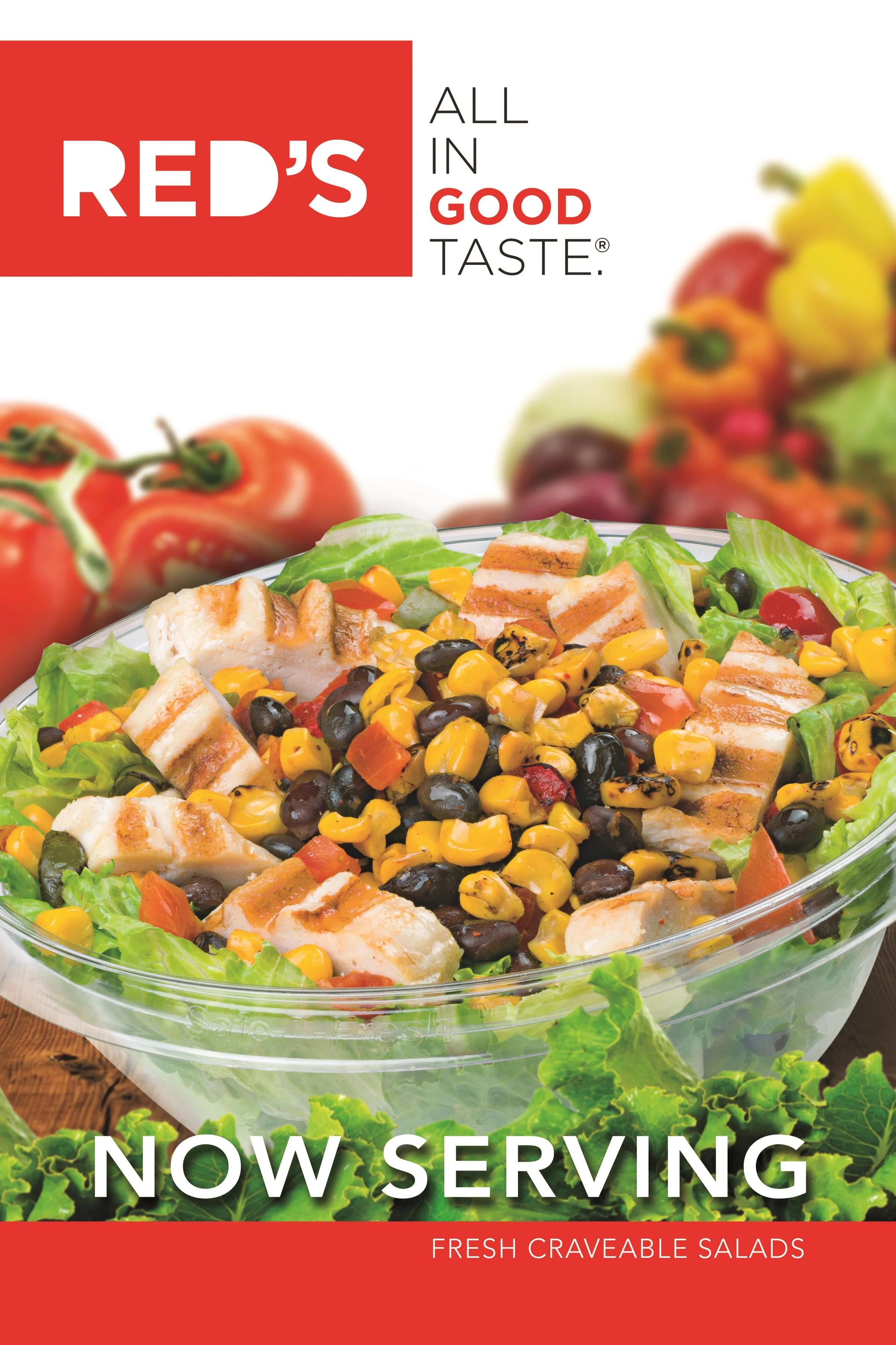
Fresh New Offerings
A healthy, crisp nourishing salad: it's what we all crave, right? Well...not always. However, with the bold colors and savory presentation, this salad is anything but bland. Food styling and professionally shot photos added to the mouth watering quality of this advertisement.
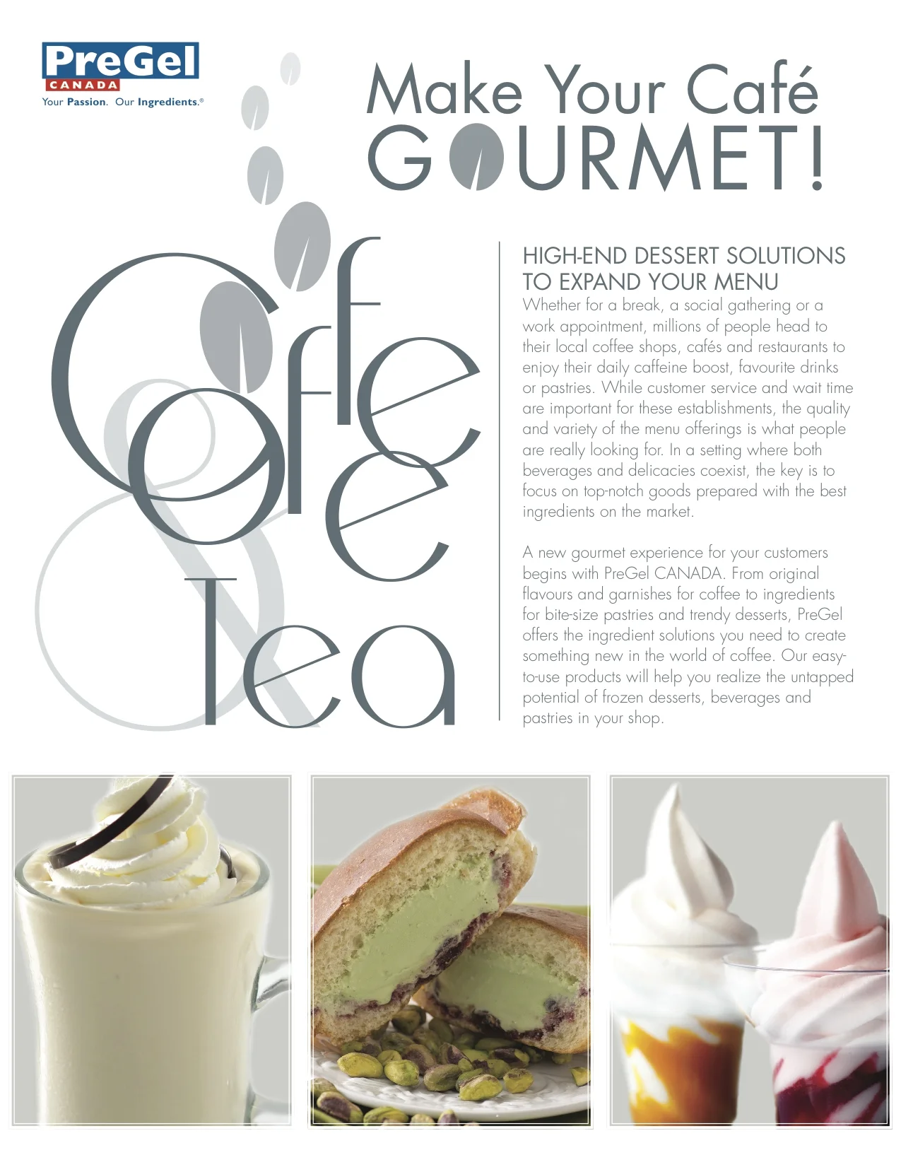
Dessert Drinks & Pastries
A brochure was needed for an event in Canada spotlighting sweet treats to enjoy with your favorite hot beverage. We wanted to employ a sleek, modern design in order to create a spotlight on these delicious, beautiful treats. The brochure's clean design mimicked the other pieces of collateral on display at this particular show.
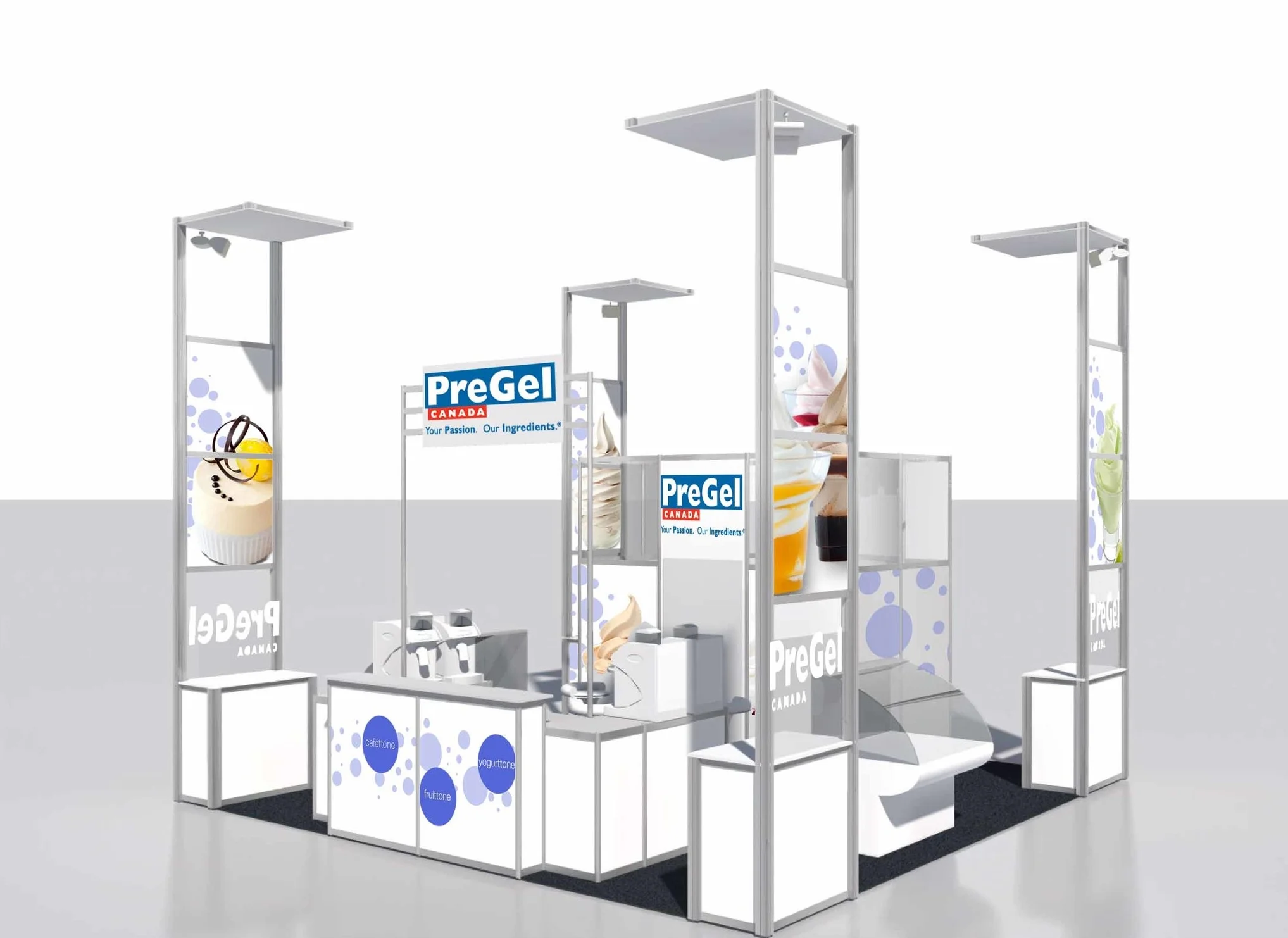
Trade Show Booth
Again, a sleek, modern design was utilized to keep the focus on the delectable desserts and frozen beverages. This event took place in the Canadian market and was meant to engage potential business owners. This "island" style booth needed to offer both form and function. All angles were viewable and needed to showcase bright, sumptuous treats.
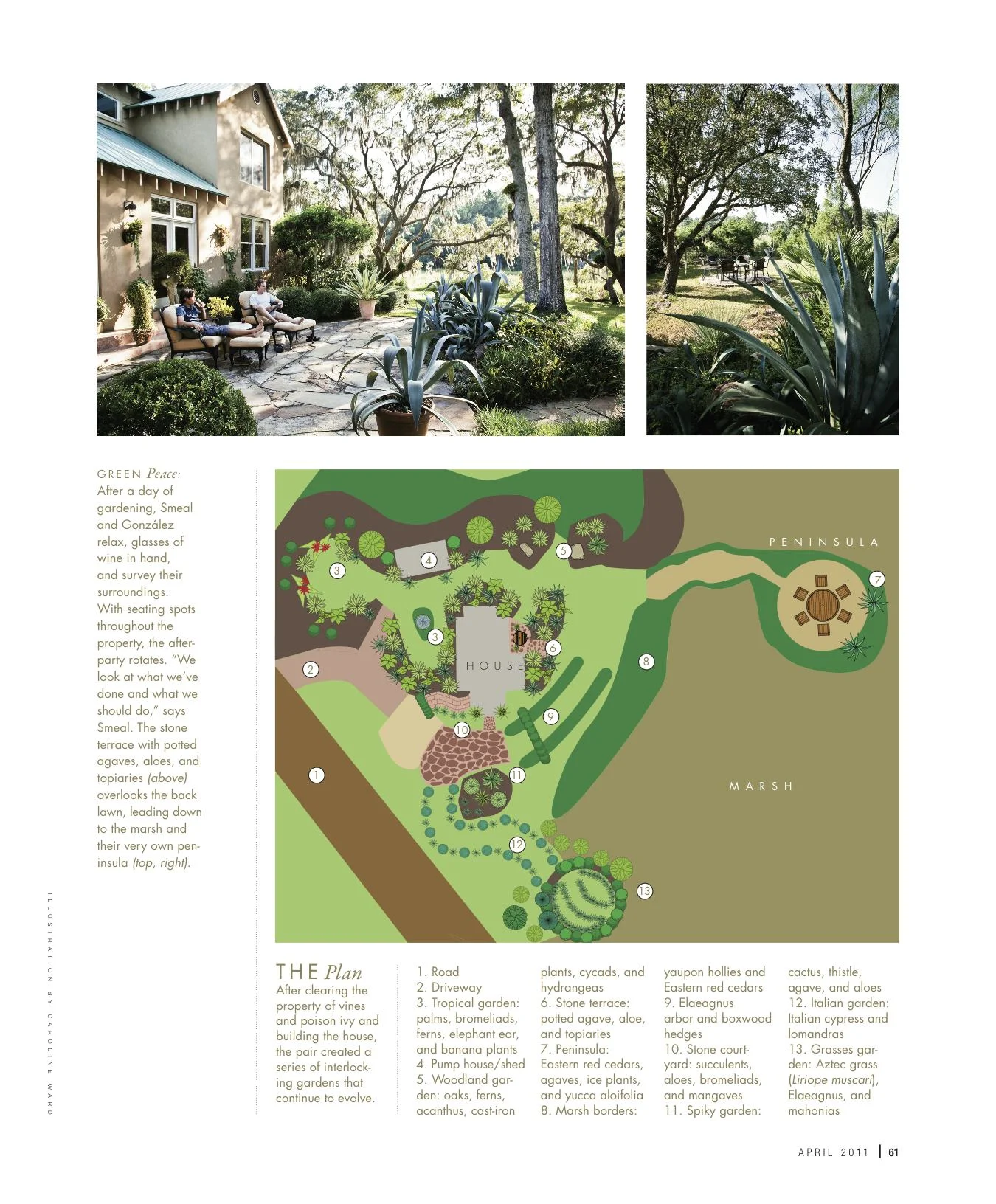
Landscape Illustration
The garden of a James Island couple was magnificently manicured and displayed through a photographic spread in Charleston Magazine. While all the photos were incredibly impressive, an illustration was need to show the incredible magnitude of the gardens and the range of plants and flowers on display.
Logo & Brand Design
A brand identity concept was needed for a historic preservation society. The challenge: this logo needed to work locally, nationally and globally. The dark, "Charleston" green was used, in addition to design elements to reflect the local architecture. This brand package was carried into social media, website, advertisements and other pieces of collateral.
Real Estate Guide
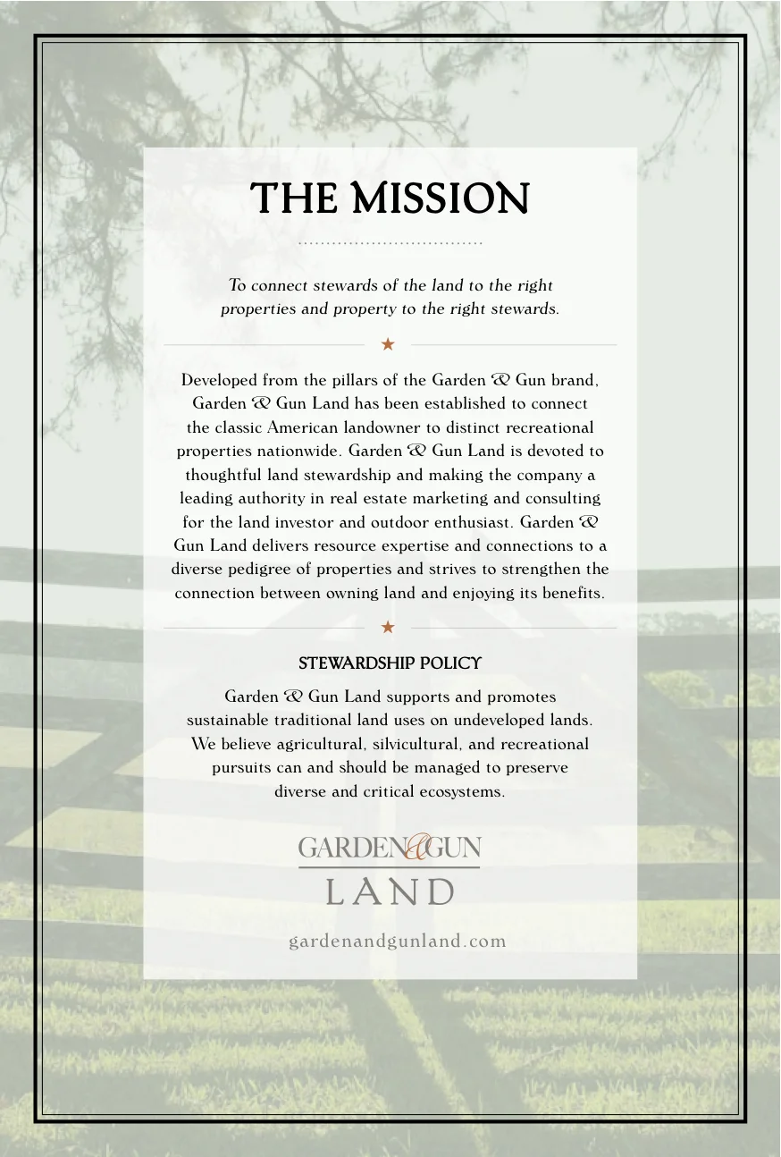
Garden & Gun was expanding their market into the real estate realm. The direction of these marketing pieces needed to provide information to consumers as a stand alone sector of business while remaining true to the existing brand. The same earthy tones and clean fonts were used, as in other G&G pieces, but this project established a more formal, professional tone to establish this business.


